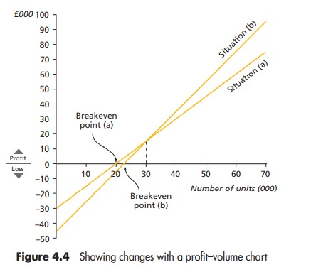
Question 4.7.1: The profit–volume chart is shown in Figure 4.4 . The two l...
A company manufactures a single product which incurs fixed costs of £30,000 per annum. Annual sales are budgeted to be 70,000 units at a sales price of £30 per unit. Variable costs are £28.50 per unit.
(a) Draw a profit–volume graph, and use it to determine the breakeven point.
The company is now considering improving the quality of the product and increasing the selling price to£35 per unit. Sales volume will be unaffected, but fixed costs will increase to £45,000 per annum and variable costs to £33 per unit.
(b) Draw, on the same graph as for part (a), a second profit–volume graph and comment on the results.
Learn more on how we answer questions.
The profit–volume chart is shown in Figure 4.4 .
The two lines have been drawn as follows:
● Situation (a). The profit for sales of 70,000 units is £75,000.
£000
Contribution 70,000 × £(30 – 28.50) 105
Fixed costs 30
Profit 75
This point is joined to the loss at zero activity, £30,000, that is, the fixed costs.
● Situation (b) . The profit for sales of 70,000 units is £95,000.
£000
Contribution 70,000 × £(35 – 33) 140
Fixed costs 45
Profit 95
This point is joined to the loss at zero activity, £45,000, that is, the fixed costs.
Comment on the results. The graph depicts clearly the larger profi ts available from option (b). It also shows
that the breakeven point increases from 20,000 units to 22,500 units but that this is not a large increase when
viewed in the context of the projected sales volume. It is also possible to see that for sales volumes above 30,000 units the profit achieved will be higher with option (b). For sales volumes below 30,000 units option (a)
will yield higher profits (or lower losses). The profit–volume graph is the clearest way of presenting information like this. If we attempted to draw two conventional breakeven charts on one set of axes the result would be a jumble, which is very difficult to interpret.